never buy lexmark again – ever!

My advice to anyone considering a new printer. Choose a Canon, or an HP, or a Fuji Xerox – anything except a Lexmark!

About 12 months ago, I bought a new colour laser printer, a Lexmark C500n, having had a gutfull of expensive inkjets with drivers that don’t get updated. I wanted to get a postscript mono printer, but family pressures for colour, and what seemed like an excellent deal from Lexmark, swayed me.

Since Leopard (OSX 10.5) was installed on a laptop at home, however, we’ve been having trouble. Investigations led me to realise that the driver is not compatible with Leopard, so I asked Lexmark for an update on when we might see a compatible driver. I got this response:

Thank you for contacting Lexmark Email Support.

In reply to your email, I am sorry to say but Lexmark C500n is a host based printer. Unfortunately, Lexmark has no plans to develop the Mac compatible driver for this printer. You can use Mac 10.4 compatible driver to run this printer on Mac Leopard. However, if it does not work then there is no other driver available to install this printer. I apologize for the inconvenience cuased to you in this regard.

Inconvenience!?! The printer cost me $400 and I’ve spent about $300 on toner… that’s quite an inconvenience, and a copy and paste apology just isn’t goint to cut it! Especially when you can still go to the Lexmark website to research the printer with the accompanying details: “Apple Macintosh Operating Systems Supported Apple Mac OS X Apple Mac OS 9.x”. Funny, I’d swear I’m using Mac OSX! This is plain old lying.

They seem to have found the resources to write a Vista driver, are there any windows users out there who want to buy a barely used printer?

the other street view

…there’s another one? I hear you gasp! Yes, it seems the old one about imitation being the sincerest form of flattery has struck a chord at streetdirectory.com.au – and they obviously love Google!

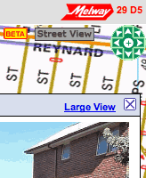
street view in brunswickThis is sort of amazing to me – I mean it’s incredible enough that a giant corporation like google pushes forward with a program of driving a car down every little lane and street in town and then stitching together the visuals, now we’ve got our own home-grown version!

Try it out at this intersection in Brunswick. Wierdly, that link, which I copied from the ‘send a link’ tool on their site, ends up displaying a street 300m to the north, so there’s obviously a bug or two there, but ignore that and start counting the similarities.

  • For a start, it’s called “Street View” – I’m sure the big G will have something to say about that.
  • You can tell which streets have the imagery by the blue purple outline.
  • How cute, they’ve got a little yellow man on a green arrow the you can drag and drop on aforementioned outlined streets. Where have I seen that before?
  • There are similar navigation tools to Google’s, but they’re terribly ugly and as soon as you try to drag an image around, you’ll see that they don’t work like Google’s – they really don’t work at all! (browser hangs… doh!)
  • On the positive side, the images are much higher resolution than you get in Google. The ‘large view’ shows it off very nicely. On the flipside, the bigger images completely break the experience of ‘moving’ along a street as each image takes it’s sweet time to refresh.
  • Just like Google, faces are blurry, but unlike Google, it’s obviously been done manually, by someone with photoshop and a blur tool
  • There’s a little ‘BETA’ tag to let us know that this software might have some bugs – well, they got that right!

OK, so I’m a big fan of the Melways street directory: it’s a great publication and I’ve worn out more copies than I can remember – they draw great maps. Due to peculiarities of projection, it’s never translated comfortably to the online version, but this latest venture just seems preposterous – especially when it’s been released with so many shortcomings. Isn’t there some business rule about playing to your strengths?

Published
Categorized as geo, tech

a change in the weather

Melburnians are obsessed with weather. More accurately, we are obsessed with predicting the weather. Of course it’s a national joke that we can have four seasons in one day, but we don’t mind that as long as we can tell when those seasons will fall. Our chief tool in this quest, is the venerable BOM – the Bureau of Meteorology website.

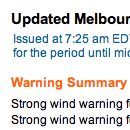
Bureau of Meterology Melbourne forecastThe buzz among Melbourne’s weather nerds this morning is the change of format on the forecast pages. It’s gone from the old ‘typerwriter’ format to a newly styled html format and I have to ask… why?

OK, I’m not questioning why you would change, there are benefits to structuring html instead of the old ‘blob’ of text. Well structured html can enable all sorts of wonderful trickery – especially when it’s data related. The more granular and identifiable the pieces of data, the more useful they become. Of course, along with well structured html comes the opportunity to introduce richer and more meaningful style. So there are two really compelling reasons why this move by the BOM might have been a good idea. Unfortunately, and mysteriously, they’ve missed both opportunities!

I don’t want to get too long winded with this, but let’s start with a simple example of what they could have done and completely missed… warnings. There is a section at the top of the page, which lists current warnings. The heading has been given a class of ‘warning’, but the paragraphs that follow are simply styled with a class of ‘sl’ – a generic class that has been used repeatedly all over the page. So, if I wanted to create a tool that automatically extracted warning information from this page, I could easily look for the ‘warning’ heading, but determining how much of what followed was the text of the warning would be much harder and involve a degree of guesswork. Compare this with how I think it should have been done: a div of id=’warnings’ containing a heading and an unordered list. Easy to identify on the page, simple to extract the information, easy to target with styles. This sort of problem is repeated throughout the page. Such a shame to see a rich source of information such as this wasted by poorly structured data.

So, we’ve established there are problems with the html, but there is still a fair bit of scope in the new structure for styling it reasonably to at least make it easy to read on screen. So what did they do? It seems as though they have attempted to make the new html look as much as possible like the old teletype. It’s horrible! They could have used size, font, indents – all sorts of typographic devices – to break this information into more easily digested visual bites, but no, we have a slab of ‘monotext’. It lacks variety, relief, hierarchy and interest. I think, if anything, it’s harder to read than the old format. Don’t believe me? Take a look at the ‘Around Melbourne’ section – where the forecast maximum temperature for Frankston is actually closer on the page to the word ‘Geelong’ with no visual clues as to which is related to which. OK, our logic tells us that the temp follows the name, but a page shouldn’t be relying on the user’s knowledge of data structures in order to get it’s message across.

I’ve said enough – it’s a good example of a badly done redevelopment – shame!

Flickr’s open (street) map

osm flickr layerI don’t know when this happened, but last night when I placed some photos on my flickr map, I was delighted to see that (in certain areas, and at certain magnifications) they have started to use OpenStreetMap for the map layer.

Yahoo were generous enough to allow OSM to use their satellite data as a reference overlay for constructing maps, so I think this is a natural flipside of that. Personally, I think it’s great that I can place photos on a map that I also contribute to. Three cheers for open source!

Published
Categorized as geo, tech

Domain – first to market with Street View?

Checking my moderation queue, and noticed a comment on yesterday’s street view post, that seems to be from someone on the Domain team. I didn’t see the comment until this morning, but I did receive an announcement email from Domain yesterday and was mightily impressed with their use of streetview.

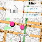
Obviously, they’ve had access to the service for a little while now and have implemented a slick tab method of switching between street view and map view. In fact, I think it’s better, or at least more intuitive than the default ‘balloon’ that most google maps use.

With this release, Australians are entering a whole new dimension of real estate and travel. Without even thinking about it, I have already checked out a hotel I am hoping to book in Adelaide (confirmed easy access to the Torrens and gardens), I also poked around a couple of interesting properties in Fitzroy ad noted that while the real estate pages mention nothing about graffiti, the street view shot clearly shows that the property is regarded as a bit of a ‘canvas’ by locals.

What I can’t quite fathom about Street View in Australia, is the incredible coverage. I can understand the Google investment in cities and tourism areas – there’s an obvious commercial return there, but I am completely puzzled (and delighted) that they seem to have driven from Jamieson up the Woods Point road to Gaffney’s Creek! That’s impressive!

I’m sure we’re going to hear a lot about this in the coming weeks. My congratulations to the team at Google for such an impressive launch and also to Domain for an excellent commercial implementation. Go check it out!

Street view invades Australia

I can’t wait for the conspiracy theorists to get going on this one – Google have released Street View on their maps in Australia. Unlike earlier releases, this is a massive and dense coverage… amazing detail.

The face blurring technology is in full swing, and not very discriminate – blurring both the wheels on my car, as well as heaps of other vaguely face like things.

Anyway, I’m pleased I wasn’t imagining things when I spotted the Google car last March.

Semacode vs QRcode

This week has been a big one in the mobile phone world. Debate about the iPhone and the plans available to use here in Australia has been everywhere. At the same time, however, Telstra has been heavily pushing its venture into barcodes with the introduction of QRcodes to the Australian market.

I say introduction because that is the word Telstra are using, but in reality the technology is not theirs and has been around and freely available for download and use on java capable mobile phones for the better part of a year. They are characterising it as some sort of breakthrough, but of course, it’s not.

That’s not to say I don’t think these things have merit – I believe the concept is great, in fact, I use it regularly at work when testing sites on mobile phones and I don’t want to type in long URLs on the keypad, I just load up a code, snap it with the camera straight from the screen and it takes me there.

What is not well known is that there are two commonly used types of code: Semacode and QRcode, both seem to do the same thing and there’s no reason why you can’t have both readers on your mobile phone, so I am curious about the pros and cons.

QRcode seems to be the underdog, being mostly confined to the Japanese market and (in my simple test at least), almost half as efficient as Semacode in rendering a URL (841 pixels vs. 484 pixels), but it still seems to work well though in use, I find Semacode better.

Comparison of QRcode and Semacode

Efficiency is a key factor for usability where conditions are less than ideal – dodgy cameras, poor lighting, movement and parallex – all make it harder for the software to recognise the patterns, so it’s a given that the less pixels you have to capture and interpret, the less mistakes you will make.

Semacode also seem to be doing interesting things with Social Networking tools and have a Facebook app, so you can generate your own personal card that others can ‘grab’.

The good news is that you don’t need to make a decision. Telstra are saying in their ads that you ‘get the software from your Telstra dealer’, like it’s some exclusive deal, but in reality you can download both readers freely: I’ve been using the readers from Semacode and Kaywa, but I’ve just found this one called beetagg which apparently reads both.

You can also create codes easily, with loads of open source libraries and online tools, once again from Semacode, Kaywa and there are generators that do both from Nokia and Beetagg.

Enjoy 😉

Published
Categorized as tech, work

the appstore door is open

Not officially launched yet, but if you search for likely keywords (try ‘photo’) in iTunes Music Store, your results might include some applications.

app store

Click through to “see all” and you’ll be presented with a heap of apps you can download and install – yay! I’ve only been getting the free ones, but there’s loads in there to buy also and not stupidly priced either – I think this is going to be a hit. How do Apple keep pulling this stuff off?

make your maps open maps

This week Google announced (yet) another new feature of it’s mapping toolset. For a little while now, we’ve been able to ‘submit’ alterations via the maps interface – moving things here and there – a quick look at Google Maps Recent Edits shows that it’s quite popular. The latest thing is Map Maker, which is a bit like My Maps, except your edits may eventually find their way into the public maps.

Nice idea, but if you have a close look, you don’t get a lot for your efforts. Pan around google maps and you’ll see the copyright message in the lower corner that attributes the data source of the various providers, but don’t expect to see your name there any time soon… no, if you submit data via mapmaker (assuming you are in one of the areas currently open), that’s the last you’ll see of that little piece of intellectual property. Furthermore, if your edits ever do make it to the public maps, they’ll be under the same restrictions as all the commercial data. Google might be touting this as some kind of community effort, but it aint.

Contrast their approach with that of Open Street Map: an active supportive community; great editing tools; open to anyone; your edits appear on the main map within a week; infinite detail; the list goes on. Sure OSM doesn’t yet have the detail of Google in all areas, but where the community is active and strong, the data is way better than Google’s.

Google’s wayward sense of direction.Just around the corner from my work is an example. The Elizabeth Street roundabout is one of the busiest intersections in Melbourne. It’s daunting enough for locals, but if you’re from out of town, it would help to have a good map. Superficially, OSM and Google are similar, but if you look closely you start to see the problems:

  • For a start, the Dental Hospital hasn’t been there for about 10 years. The building is derelict. OSM knows where it is now.
  • According to Google, it looks like Grattan street doesn’t make it all the way across Royal Parade, which Google thinks is the Hume Highway… hmm!
  • and what is it with the way all the service lanes join the roads as they approach the roundabout on Google? I can assure you – this is fantasy.
  • OSM aso seems to know what it’s doing with one way streets – something Google has real trouble with. Maybe they don’t know we drive on the left in Australia, but my colleague big ben pointed out the other day that following Google’s directions from one part of Grattan Street to another will get you into a lot of trouble!

Anyway, the point of this is not to bag Google maps – they are fantastic, they have popularised digital mapping and changed the way we get from one place to another… but, they are still a company and you we still rely on them to provide the service and the tools to go with it. OSM on the other hand is open source – the data is there for everyone to use – tools can be created, crafted, improved and distributed without messy licencing. Wikipedia was recently shown to be every bit as comprehensive and accurate as the venerable Encyclopaedia Britannica and so it will be with OSM. It will be the mapping tool by which all others are judged. So if you’re thinking of making maps – do it the open way!

Published
Categorized as geo, tech

Apple’s iTunes rip-off

I remember waiting with huge anticipation for Apple to launch iTunes in Australia – the rumours got thicker and faster until it finally arrived. The store finally launched with tracks selling at $1.69 each.

At the time, as I recall, the aussie dollar was about $us0.65¢ so we were effectively paying about $us1.10 while the US pricing was only $us0.99¢ – that seemed a little unfair at the time, but no-one seemed too fussed.

Roll forward to today: the aussie dollar is sitting on $us0.95¢, but tracks are still the same price, which means we’re actually paying a little over $us 1.60 per track! That’s quite a bit more than our US counterparts – certainly enough to make most CDs better value.

With the parlous state of the US economy and their sliding dollar, I’m sure we’re not the only market where iTunes is starting to look expensive.

A week in touch

I’ve had the pleasure of using an iPod Touch for the last week. As much as I like my music, I’ve never really felt the need to upgrade from my old ‘gumstick’ 1Gb shuffle, but we’ve got one at work with the intention mainly of testing podcasts and public facing services.

Yes, the multi touch is cool, the screen is brilliant, the wifi easy to use – all just so sweet. So, what can I say about my week that hasn’t already been said a million times in a million other reviews? I’ll try to stick to a couple of things that have impressed me.

Keep smiling – just in case!

If you’re hanging around the streets of Melbourne, keep a happy face on. I saw a car on Macarthur Avenue crossing Royal Parade yesterday, that looked very much like the Google Street View car that was seen in Geelong last year. Big thing of cameras and a little round GPS aerial on top of the roof rack.

I don’t think it was taking shots at the time, late in the day, the traffic was woeful and they were probably finished for the day, but it’s a reminder of that quote that Alan Funt used to use at the end of every show… something like: No matter where you are, or what you’re doing… smile, because you’re on Candid Camera!

Published
Categorized as fun, tech