It’s war out there, you know! This morning, as I rode my trusty treadly to work, I copped a bit of verbal abuse. Nothing terribly unusual about that, when the traffic is bad – bad things happen. This time it was different though, I was copping it from another cyclist.
I’ll step back a moment. I ride a pushie, I occasionally ride a motorbike, and very occasionally I drive a car. I often see dickheads driving cars and trucks, I sometimes see dickheads riding motorbikes, and I occasionally see dickheads riding pushbikes. If I was honest, I’d say the proportions are roughly the same.
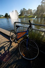
The three serious accidents I’ve personally seen this year involving a pushbike were caused by… another pushbike! Two were caused by a pushbike rider crossing a stationery column of car traffic, but failing to look for bikes in the cycle lane. The third was caused by a cyclist coasting through a red pedestrian light – only to slam into a cyclist walking their bike across the crossing. Stupid, stupid stuff. Incidentally, all three of these happened on Royal Parade near Melbourne Uni.
Anyway, forward to today. It’s a bit of a bunfight along Royal Parade – there are always fast and slow cyclists – occasionally cars trying to turn or park – I find a little bit of patience goes a long way. There is one cyclist, however, who is riding pretty hard – at one stage, he got in the way of a car taking off from a traffic light – wobbling all over the place and using the car’s lane – technically illegal, but we all know the law is an ass. So, that was one pissed off driver. Funnily though, through all his puffing and pushing, I was still ahead of him as we approached Grattan Street, where the lights had just gone red. Ahead of me was a van in the right lane, indicator on, trying to get across to the left lane, so I slowed to let him across. He was uncertain, so in the end I almost stopped before he crossed. He was nothing but curteous, he did no wrong, he was in a tricky spot and I let him go.
Anyway, I coast to the red light, when this guy pulls up beside me and says ‘never give them an inch’. To which I replied, that I wouldn’t be taking his advice, because I didn’t think much of the way he rode. This seemed to upset him a little – he said I’d nearly caused him to run into the back of me (remember, we’re in a narrow lane about 30 metres from a red light here – what is the point in going fast?), but when I pointed out that in anyone’s eyes, that would have been his fault, he shut up. Anyway, as I said to him. I’ve been commuting by bike for 25 years (actually, it’s 28… getting old!) and I’ve had plenty of opportunity to decide the way I’ll ride.
In recent years, my attitude has softened a little and I’ve taken pains to ride within the law as much as possible (on both motorbike and pushbike), even when the law seems stupid. I’ve also been more patient and forgiving to other road users – even when they do stupid things.
At first, I adopted this strategy simply to gain the high moral ground… I figured, I couldn’t get cranky with drivers breaking the law and doing stupid things, if I turned around and did the same. What actually happened was that I stopped copping abuse, I started getting waves and smiles instead of fingers and scowls. Sure, drivers still do dumb things, I still get cranky with them, but I’m a commuter, not some sort of policeman. I let them have it at the time, but I don’t take it on myself to teach them some manners. End result, I enjoy my cycling more… well, except for today, when a feral biker gave me some lip!
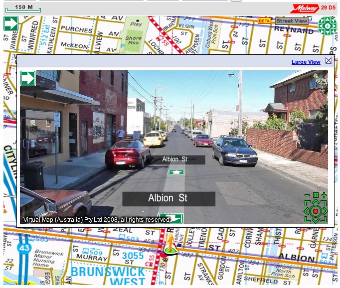


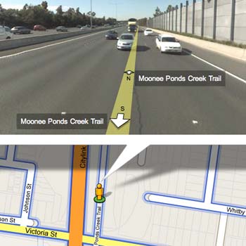
 I don’t know when this happened, but last night when I placed some photos on