Code like it’s 1995!

Remember those sites that used to proudly pronounce that they were ‘Best viewed in Netscape 4 or above’, a practice we thankfully don’t see much of any more?
Well, today I had occasion to look something up on the Melbourne Bike Share website, and not being sure of the URL I ran it by Google with the following amusing result…


So, the service is “proudly supported by: This site is optimised for Internet Explorer 7.0 or newer…”, hmmm, presumably the letter B and the number 7 had a hand in it too!

Seriously though, it’s simply a warning for users of that outdated box of hammers that is IE6 to get with the program and upgrade. However, if it’s only meant for them, why are they broadcasting it to the world? Two words guys: Conditional Comments!

But why does it show up in the Google results this way? Because the supporters are represented by images WITH NO ALT TEXT! I’m sure they’d be delighted to know that!

spanked by the Germans

Like every other Aussie with a passing interest in the world cup, I vaguely hoped that the match against Germany would result in some national pride – even if a win was out of the question! Alas, a drubbing at the hands of an in form outfit. Blame is being apportioned to various parties, but in the end, they were just way too good and the hapless socceroos could not contain them.

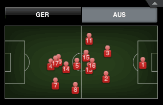
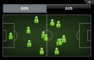
Of course there are stats everywhere about the games and who did what, but I was astonished to find this graphic in the (excellent) ESPN iPhone App. It’s a map of where each player’s average position was on the field. Germany, as you can clearly see, were a picture of composure and organisation.

Germany average position map
Australia’s map, on the other hand, vaguely reminds me of the distribution pattern of chickens when you throw food on the ground.

Australian average position map
I really don’t know what it all means, but it’s a starkly clear difference, ain’t it?

Published
Categorized as fun

microsoft larfs

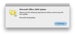
Having kicked off a mac vs. pc flame war on work’s IT mailing list this morning, I was delighted to see the following irony play out on screen. As the good folk debated the weight of downloads and updates, Microsoft AutoUpdate launched and proceeded to tell me I needed 150Mb. of sealing wax to plug a few holes. Half way through, I get this priceless message…

Thank you Microsoft 🙂

Published
Categorized as fun, tech

about 100 metres…

For me, one of the high points of Australian television entertainment was The Games, and one of the high points of that series was episode 4, series 1, Robbo and the 100 metres. Even reading the script cracks me up (the particular scene starts around page 5), but at the risk of providing a spoiler to those who haven’t come across it before, the premise of the episode centers around a 100 metre track that is about 100 metres… well, 94 metres to be exact. It’s just too ludicrous to be real, which is why it’s so side-splittingly funny.

JOHN: But what you’re telling me is the 100-metre track is about 100 metres long.

Too ludicrous? well, you would have thought so, that is, until last weekend when they held the Melbourne marathon. Seems like the Marathon and Half Marathon were the prescribed distance, but someone played fast and loose with accuracy when it came to the 5km. and 10km. events, but to quote Dallas O’Brien, the event director: the 5km and 10km courses were not measured to the same exacting standards“, and “perhaps we should have highlighted the fact that they weren’t 100 per cent accurate”.

Not 100% ? How about 84% ?? because that would have been about right, yes the 5km. route was only 4.2km! Now, most runners are pretty aware of how fast and far they’ve run – these things tend to be important. Many carry personal GPS devices and can tell you within a few metres just how far they’ve run. Pity the organisers didn’t apply the same rigour: “The five and 10 were both measured by a bike computer. We got them as close as we could.”. This is, of course, complete rubbish and a totally lame excuse. It took me no more than 5 minutes with Google maps to trace the route and get exactly the same answer as the runners got. The 10km route was not quite so far off – but at 9.4km (exactly the same percentage error as the fictional 100m track), you can bet it got some people excited about personal best times before the true horror dawned on them.

A little message for Mr. O’Brien, either get a new battery for that bike computer, or pump up the tyres, but don’t, in future, take people for idiots… did you think they wouldn’t notice?

there is sanity after all…

It’s quite natural to find stories/jokes/etc. about your own profession amusing. Those engaged in law enforcement all have their favourite cop show. Teachers just love Teachers and the priceless Gormsby. I got plenty of laughs out The IT Crowd.

In true IT fashion though, my favourite piece of work that really tells my life like it is, is a blog.
Tales from Redesignland is just brilliant, and although the author claims to be from a university in California, I am sure they have a secret webcam trained on my desk to capture all the insanity that goes on there.

This latest episode is just too much. I’m starting to get paranoid.

Published
Categorized as fun

yay for lolcats!

I am soooo web 2 point OH! I have just created my first lolcat using a photo I took of Viv enjoying yesterday’s warm weather. If you’re a member of ichc, you should definitely click on the picture and vote for my pic.

funny pictures

Published
Categorized as fun, personal

the city bike…

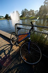
the city bikeIf you’re visiting Adelaide and you like to ride a bike, you’re in luck. The city has a scheme of free bicycle hire it calls City Bikes. Yep, totally free – all you have to do is provide some sort of ID as collateral (eg: licence, passport), and you’re on your way, with a bike, helmet and lock.
The city is as flat as a pancake, the roads are generally wide and almost always quiet, and the parks have a network of well maintained trails. It is paradise on two wheels!

now THIS is a bike path!

… but what are all those cars doing on it?

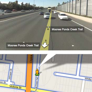
According to Google Maps ‘blue outlined streets’ have Street View, so I was surprised to see that they must have left the car behind one day and hopped on a bicycle, because the Moonee Ponds Creek bicycle trail was outlined in blue just near my house. Alas, the Street View pics don’t give a true representation of the bike path – it seems wider and busier than I remember it.

The Moonee Ponds Creek Tollway

Uh-oh! algorithm troubles! That looks very much like the nearby tulla freeway. I’m sure we’re going to see a lot more interesting anomolies among the new Australian images.

where was their spirit of adventure?

One of the fascinating things about Google’s Street View coverage of Australia is the amazingly out of the way places they got to. I love this aspect – dirt roads that wind along in the back blocks of the never never.

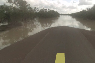
Anyway, I was panning around the Gulf Country of far north Queensland when I noticed the blue line didn’t go all the way to Normanton. Odd – so I dropped the little yellow guy as close as I could to the end of the line and saw in the distance what looked like… yes, I think it is… water! Ha! that’s the Gulf Country for you.

Burke development road

No wonder they never got to Normanton 🙂

Post title in here…

headline in here…thanks ta!

I suppose the Moreland Leader is under resourced like so many organisations are these days, so between the cleaner and the work experience guy who answers the phones, they have to get a lot done to get an issue out the door.

Not surprising then, that little things go astray, like this beautifully edited page 11 of the March 10 issue, 2008. It’s gotta go down as one of the greatest pieces of copywriting ever… have we missed the nomination date for the Walkley’s?