Apexel 100mm Ultra Macro Lens for Smartphones

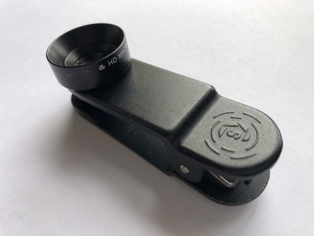
I can’t help myself with cool looking gadgets, and this lens certainly seemed to pack the goods. I mean, just look at that hunk of glass!

Unfortunately, as so often happens, the reality of online shopping isn’t always up to expectations.

Don’t get me wrong, it’s good. The lens is as good as it looks – that glass delivers a clean, sharp image across the sensor – no fall off or distortion in the corners. The mount is pretty solid, delivery was prompt, and the price is excellent. So, what’s the problem?

I expected more magnification.

There’s only one real ‘comparison’ image on their website, and it depicts a fly – one shot with the straight phone lens, and the other with the HB100 Ultra Macro. Based on this comparison, you’d be hoping for the 4x magnification depicted… you’d be disappointed.

I suspect the reason they’ve used a 16 Pro Max for this comparison is so that they can also leverage the optical zoom on that phone. So, what you see here is not comparing apples with apples, it’s a bit of smoke and mirrors to stretch the truth.

To give you a more realistic view of what to expect… here are some results from my iPhone 13 Mini (yes, I’m still using that!). First a photo with the standard lens, no zoom. You can see why I’m looking at a clip on macro!

Next, with the Apexel 100mm Ultra Macro Lens in place, but no zoom. Almost exactly 2x magnification. The clarity is great – I just haven’t enhanced the shot at all, and it’s not the full size file, so it does look a little dull – that’s not the fault of the lens.

The 13 Mini has no optical zoom – only digital, so this next shot is about 2x digital zoom and 2x macro for a 400% enlargement. Still looks great, but it’s still well short of what was ‘promised’ on the website, and if I go further, the digital zoom will start to be apparent.

I’m not unhappy – this level of magnification is pretty good for my needs, and the clarity is better than I’d expected, so it still represents good value – especially if you have a phone with a good optical zoom. They just didn’t need to fib to sell it – if they’d just provided an honest comparison, it would have been fine.

Digitising 35mm negatives – a quick method

Between my father and I, there’s a lot of memories sitting in shoeboxes around the house. They’re not all great photos, but there are some great memories. Scanning them is slow, and when my scanner died recently, I almost gave up. Almost! 😉

This is a clip on macro lens from Struman Optics. It fits on any phone/tablet and produces a reasonable quality image. Most importantly, the macro is only 2.8x magnification. This means the captured area is around the size of a 35mm negative.

I cut a foam block to hold my phone just the right distance (25mm) from the negative.

I used a lightbox I’d already fashioned out of a plastic bucket, and some USB powered LED strip lights… (yes, we’re seriously low budget here!).
The negative carrier is from my old, dead epson scanner, but I don’t think it’d be too hard to fashion one out of card.

Now, here’s one of the fun bits.
On an iPhone, in Settings > Accessibility > Accessiblity Shortcuts … you can set a shortcut to invert colours on the screen. I use a triple click of the home button.

So, when I feed a negative strip through, I can get a reasonable preview of what the image is before capture.

This is important, because… well, TBH, there’s a lot of boring photos!

With iCloud photos, in a very short time, the images are available in the Photos app on my computer. I rotate and flip them before handing them off to Photoshop for the next step.

Invert the image, then head to Curves, and the advanced Options. Using Enhance Per Channel Contrast will get you 95% there most of the time. Save it as the default, and you’re ready to churn through them.

Save and close, and they’re back in Photos and ready for any tagging and fine tuning.

Samples – links open in a new tab:

Published
Categorized as photos, tech

Net work

woowoowoo posted a photo:

Net work

The most remarkable (judging by conversations) aspect of the building seemed to be the nets. Presumably, they are to stop stressed Phd students ending it all spectacularly on the floor of the atrium. Unfortunately, I found they just ruined the idea of interior interior space entirely. Instead of a sense of air and freedom, you feel like so many sardines trapped by a trawler. It looks half arsed, dystopian, prisonlike, an afterthought to resolve the disjoint between an architects vision, and the real world. Did not like.

Oh, and as for safety. The net just screams out “CLIMB ME”. They say it’s not going to happen. I’m sorry, my tip is that there’ll be organised flag races before the first semester is up.

One thing I liked. The little study tables around the balcony (you can just see the corner of one on the left), they give a nod to the old style drafting table. Wood trim and green linoleum covering.

Last friday, staff were invited to inspect the new Faculty of Architecture building. It reeks of … architecture!

via Flickr / woowoowoo

Angular

woowoowoo posted a photo:

Angular

Certainly the sort of building which encourages you to tilt your camera at a funny angle 😉

Last friday, staff were invited to inspect the new Faculty of Architecture building. It reeks of … architecture!

via Flickr / woowoowoo

Splash

woowoowoo posted a photo:

Splash

An interesting break in the colour scheme. Is this a nod to the 80’s?

By the way, this shot was taken from a walkway where anything dropped will fall some 20m. onto whoever happens to be passing below. Does anyone else see a problem with that?

Last friday, staff were invited to inspect the new Faculty of Architecture building. It reeks of … architecture!

via Flickr / woowoowoo