Like every other Aussie with a passing interest in the world cup, I vaguely hoped that the match against Germany would result in some national pride – even if a win was out of the question! Alas, a drubbing at the hands of an in form outfit. Blame is being apportioned to various parties, but in the end, they were just way too good and the hapless socceroos could not contain them.
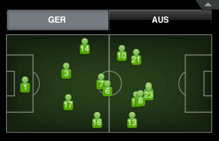
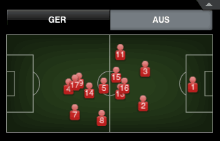
Of course there are stats everywhere about the games and who did what, but I was astonished to find this graphic in the (excellent) ESPN iPhone App. It’s a map of where each player’s average position was on the field. Germany, as you can clearly see, were a picture of composure and organisation.

Australia’s map, on the other hand, vaguely reminds me of the distribution pattern of chickens when you throw food on the ground.

I really don’t know what it all means, but it’s a starkly clear difference, ain’t it?